This one is for question number thirteen (:

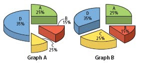
13. a) The two circle graphs are meant to represent the same information. Does it appear this way? Explain.
The graphs do not appear to display the same information because D appears to be much bigger and C is much smaller. This could confuse people who do not look at the data.
b) Identify the errors in graph A.
The sizes of the sectors in graph A don't go with their percents.
c) Draw a new graph to represent the data more accurately.

& I'm so sorry if its confusing for you guys !!
LEAVE A COMMENT ! :)
good job steph, you had nice pictures.. and explained the questions quite well
ReplyDeletegood job!! you explained it really well
ReplyDeleteyeah good job steph you explained the post nicely and well placed including the pictures :)
ReplyDelete